At Check Cherry, we see a lot of fantastic photographer websites. We also see our fair share of websites that are in desperate need of a redesign. Below is a list of the most common mistakes people make when building a photography business website. There's good news if you are making one or more of these mistakes. The fix is easy, and it will increase your website's effectiveness and sales.

1. They make the home page about themselves.
Your home page is the most important page of your website. Avoid making your home page feel like an "About Me" page. The best home pages introduce the services you provide because it helps people quickly understand if they should keep scrolling or hit the back button. Your website should serve people looking to hire you.
2. They let a website template control the direction.
Starting with a template is helpful—however, don't let it limit your website's flow. There are so many great website builders out there; be sure to find something that works for you, even if it costs a little extra.
3. They’re not transparent enough.
 A website's purpose is to help you sell more. The best way to facilitate this process is to make your website the most helpful resource for people who want to book you. When you give people everything they need to make a good decision, you attract more of your ideal clients and spend less time fielding questions from people who aren't a good fit.
💡Remember, the goal is not to be a fit for everyone. Instead, you want to attract people who understand your value, appreciate your service, and will spread the word by telling friends.
4. They don't list pricing and packages.
If all goes well, people looking at your website will think: "I like what I see. How much and what's included?" That's a great thing because it's the next step in the buying process. It can also happen without you having to lift a finger. Publicly showing people your packages and pricing keeps the buying process moving for 100% of the people who visit your website, not just the small percentage who reach out and ask for more information.

5. They use too much text.
Very few people will read your website from top to bottom. Avoid large blocks of condensed text. If you have a lot to say, break it up with headlines so people can scan and quickly find out what a section of your website is about before reading it.
💡Remember, most who visit your website are looking for a few simple things. People want to see your work, your package, and your pricing. If all goes well, they will want to book you online.
6. They use too many images.
Avoid making your website just a digital portfolio. While you certainly want to show your amazing work, there is a lot more to the story and often people will be confused about what to do next. You'll also miss out on some basic SEO and get a lot of the same questions.
7. They focus too much on making a beautiful website.
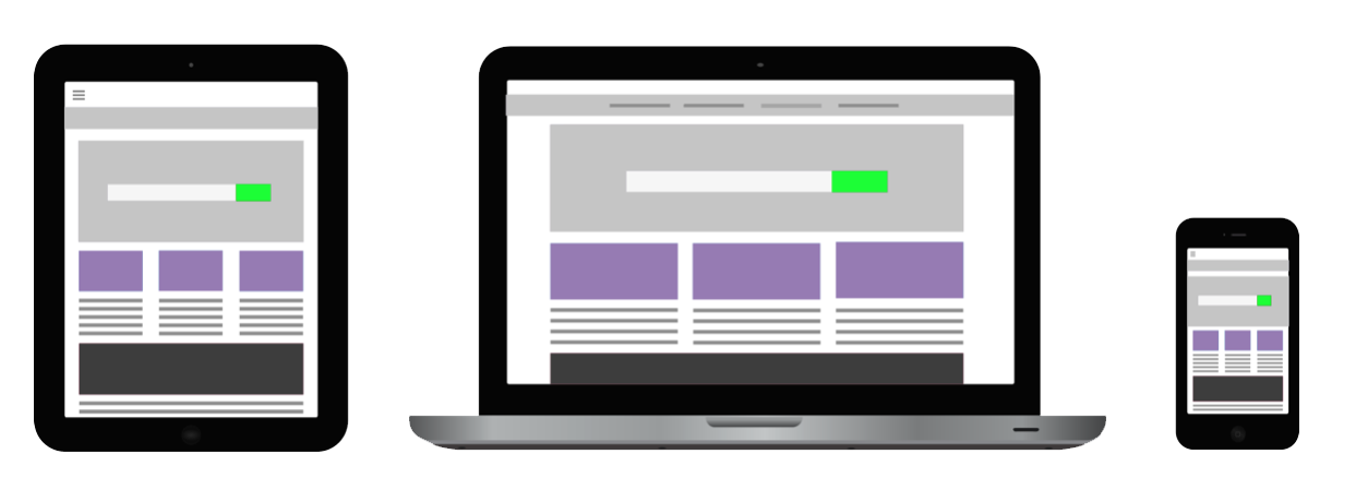
Your website needs to look great. But it also needs to be effective and easy to use. Do not sacrifice a fancy website for one that leaves people with more questions than answers. Confusion is the enemy of sales, and the more straightforward you can present your services, the better. Common signs your website is too fancy include lots of movement, hidden content with slider sliders, slow loading pages, confusing navigation, and a general lack of direction for the visitor.
8. They use weak calls-to-action.
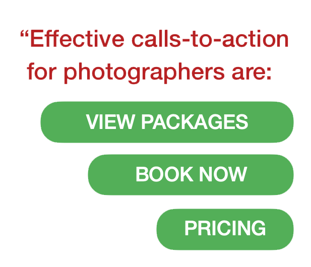
 You need to help people know where to go next if they want to continue the process of hiring you. All too often, we see people only use the "Contact Me" call-to-action, which leads to a page with a web form. Don't be shy about sprinkling in more direct calls-to-action throughout your website to remind people you are ready for their business. Effective calls-to-action for photographers are "View Packages", "Pricing" and "Book Now”.
💡 Remember, your calls-to-action should stick out like a soar thumb. Make them big colorful buttons with easy to understand intent.
9. They show lengthy testimonials.
One of the best ways to communicate with a new customer will have a good experience sharing testimonials of past clients. It's important not to overdo it. Feel free to take a few sentences out of a long one to shorten it up. Bump up the font size so it's easy to read. You only need a few and you can sprinkle them around your website so people are sure to see them.
10. They don't offer online booking.
If your website does its job well, people are going to want to know how they can book you. Clients love the convenience of online booking. It also makes you look like a true professional. A proper online booking system for your photography services will make picking a package, scheduling a date, signing a contract, and paying a deposit effortlessly. After all, when you are easy to book you get more business.